The strategic deployment of color within residential environments transcends mere aesthetics; it is a powerful tool for shaping spatial perception and influencing the emotional landscape of a home. As of 2026, understanding the nuanced impact of distinct tonal values on interior atmospheres is paramount for sophisticated residential styling. This exploration delves into the intricate relationship between color, light, and human psychology, providing homeowners with insights to craft living spaces that are both visually compelling and profoundly comforting.
The Science of Tonal Perception: Shaping Space with Light and Shadow
Color, at its core, is perceived light. The tonal value of a hue—its inherent lightness or darkness—exerts a significant influence on how a space is physically interpreted. This principle is fundamental to interior design, allowing for the deliberate manipulation of perceived room dimensions and the overall spatial feel, a crucial aspect of expert home interior design.
Light Tones: Expansion and Serenity
Lighter tonal values, encompassing delicate pastels, inviting creams, and soft grays, inherently possess a reflective quality. When applied to major surfaces such as walls and ceilings, these tones bounce and distribute available light, consequently making spaces appear larger, airier, and more open. This expansive effect is particularly beneficial in smaller rooms or areas with limited natural illumination, expertly creating an illusion of increased volumetric space. Furthermore, lighter palettes often evoke powerful feelings of cleanliness, serenity, and tranquility, fostering a profoundly calming and restorative environment for the resident.
Dark Tones: Intimacy and Sophistication
Conversely, darker tonal values—including deep charcoals, rich navies, verdant forest greens, or profound burgundies—actively absorb light. This absorption can cause walls to appear to recede, paradoxically creating a profound sense of intimacy and enclosure rather than expansion. Darker palettes are exceptional for fostering a cozy, sophisticated, or dramatically atmospheric setting, proving ideal for dedicated studies, luxurious media rooms, or master bedrooms where a deep sense of retreat and personal sanctuary is desired. Strategic use of dark tones can also artfully highlight architectural features or provide a stunning, luxurious backdrop for curated art collections and premium furnishings, enhancing the overall domestic comfort.
Mid-Tones: Balance and Versatility
Mid-range tonal values offer a harmonious and sought-after balance between the expansive qualities typically associated with light tones and the intimate embrace of darker ones. These versatile tones include earthy greens, muted blues, warm terracotta, and a wide array of sophisticated beige and greige shades. Mid-tones provide a stable and grounding foundation, offering immense versatility for subsequent layering of textures and accessorizing without ever overwhelming the inherent character of the space. They are frequently employed in central living areas and dining rooms, where a perfect balance of comfort, understated elegance, and functional adaptability is paramount. The inherent adaptability of mid-tones makes them an indispensable staple in contemporary residential design practices for 2026.
Atmospheric Engineering: Mood Through Hue and Tone
Beyond simply influencing spatial perception, the psychological impact of color on mood is an undeniable and potent force. The carefully chosen palette directly contributes to the emotional resonance of a room, directly influencing the resident’s state of mind and sense of well-being.
Warm Palettes: Energy and Comfort
Warm colors, such as vibrant reds, inviting oranges, and cheerful yellows, are inherently stimulating and energizing. Their application, especially in brighter or richer tonal variations, can inject palpable energy, enthusiasm, and a profound sense of warmth and comfort into any space. They are frequently utilized in highly social areas like bustling living rooms and active kitchens to actively encourage interaction and vitality. However, lighter, more muted warm tones can still effectively convey comfort without being overly stimulating, making them eminently suitable for bedrooms where a gentle, embracing ambiance is preferred for restful sleep.
Cool Palettes: Calm and Clarity
Blues, greens, and purples are universally categorized as cool colors, widely recognized for their calming and contemplative effects. These serene hues actively promote relaxation, enhance focus, and impart a refreshing sense of clarity. Light cool tones are frequently chosen for tranquil bathrooms and peaceful bedrooms to create a spa-like serenity, while deeper, more saturated cool tones can evoke sophistication, intellectual depth, and quiet grandeur, proving perfect for home offices, libraries, or meditation spaces. The consistent presence of cool tones often inherently suggests spaciousness, cleanliness, and mental equilibrium.
Neutral Palettes: Foundation and Flexibility
Neutrals—encompassing the broad spectrum of grays, beiges, whites, and off-whites—serve as the foundational backbone for an extensive array of residential designs. While often perceived as understated, their subtle tonal variations are incredibly crucial. A warm beige can feel exceptionally inviting and nurturing, while a cool gray can lend a distinctively modern, crisp, and minimalist edge. Neutrals offer immense design flexibility, allowing other vibrant design elements to truly shine and providing a timeless, adaptable backdrop for evolving styles. They are ideal for establishing a cohesive and seamless flow throughout an entire home and are effortlessly updated with accent colors, textures, and new decorative pieces.
2026 Trends & Material Innovations: Evolving Palettes for Modern Living
The year 2026 ushers in exciting and transformative developments in both color trends and cutting-edge material science, profoundly influencing residential styling and domestic comfort analysis.
Biophilic Integration & Earthy Tones
A significant and enduring trend is the deeper, more sophisticated integration of biophilic design principles. This translates into a pervasive presence of natural, earthy palettes—rich terracotta, deep forest greens, warm desert sands, and muted blues reminiscent of natural water bodies and skies. These tones, frequently in their softer, desaturated variations, actively foster a profound connection to the natural world, promoting enhanced well-being, tranquility, and a sense of grounding. Modern material developments include advanced bioplastics formulated with natural pigments and high recycled content, as well as innovative composite materials that meticulously mimic stone and wood textures with vastly enhanced durability and impressive sustainability credentials.
Dynamic Lighting & Color Control
Advancements in smart home technology, particularly in sophisticated lighting systems, are revolutionizing how color is perceived and experienced within the home. Advanced RGBW LED systems now offer unparalleled, granular control over both hue and tonal value, empowering homeowners to dynamically adjust the entire atmosphere of a room at will, responding to mood, time of day, or activity. Circadian lighting systems, which intelligently mimic natural light cycles, further enhance domestic comfort by subtly shifting color temperature and intensity throughout the day, positively influencing mood, productivity, and sleep patterns. The seamless interplay between highly adjustable smart lighting and carefully selected wall color offers seemingly endless possibilities for truly personalized and responsive residential environments.
Sustainable Surfaces & Pigments
Sustainability continues to be a paramount driving force in material innovation across the industry. Manufacturers are increasingly producing premium paints with exceptionally low VOCs (Volatile Organic Compounds) and incorporating plant-based pigments, thereby offering significantly healthier indoor air quality for all residents. Innovative surfaces like recycled glass tiles, sustainably harvested cork flooring, and responsibly sourced wood veneers are becoming increasingly prevalent, often featuring beautiful natural variations in tone that add inherent depth and character without requiring artificial coloration. The emphatic emphasis is placed on selecting and utilizing materials that celebrate their intrinsic beauty, natural palette, and ecological integrity.
Practical Application for Residential Styling: Crafting the Perfect Palette
Implementing these sophisticated principles of color psychology requires a thoughtful and nuanced approach tailored precisely to the specific needs, desires, and lifestyle aspirations of the resident. A meticulous process ensures optimal and harmonious results in every space.
Strategic Zone Planning
The homeowner must carefully consider the primary function and desired energy level of each individual room within the dwelling. For high-energy zones such as active kitchens, vibrant home gyms, or engaging children’s playrooms, brighter, more stimulating tonal values—even within cooler hue families—can be highly appropriate, fostering a tangible sense of vitality and engagement. Conversely, for truly restful sanctuaries like peaceful bedrooms, contemplative reading nooks, or serene meditation spaces, softer, more subdued tones that actively promote deep relaxation and tranquility are generally preferred for optimal domestic comfort. Achieving distinct functional zones within expansive open-plan layouts can be remarkably effective and visually cohesive through subtle or pronounced tonal shifts on walls, flooring, or even carefully considered ceiling treatments. This intelligent use of color creates clear visual cues that delineate different areas without the need for physical barriers, thereby enhancing both spatial flow and individual purpose.
Accentuation and Contrast
Tonal contrast serves as an extraordinarily powerful and dynamic design tool, capable of adding immense depth, compelling visual interest, and precise definition to any interior space. A room predominantly styled in light tones can find crucial grounding and sophisticated balance through the strategic inclusion of darker accents in select furniture pieces, decorative objects, or subtle architectural details. Conversely, a dark, intimate space can be artfully enlivened and deftly prevented from feeling oppressive by introducing bright, reflective elements, such as metallic finishes, polished surfaces, or vibrant, strategically placed artwork. The careful selection of accent colors—even a solitary, vibrant pop on a meticulously chosen feature wall, through luxurious textiles, or impactful statement lighting—can profoundly alter the perceived tonal balance and overall mood of a room. It is also essential for the designer and homeowner to consider the intricate interplay of texture in conjunction with tone; matte finishes tend to absorb light, creating a softer, more grounded, and tactile effect, while glossy or satin finishes reflect light, adding a sense of spaciousness, luminosity, and refined glamour, further influencing both spatial perception and tactile appeal.
Considering Natural Light Dynamics
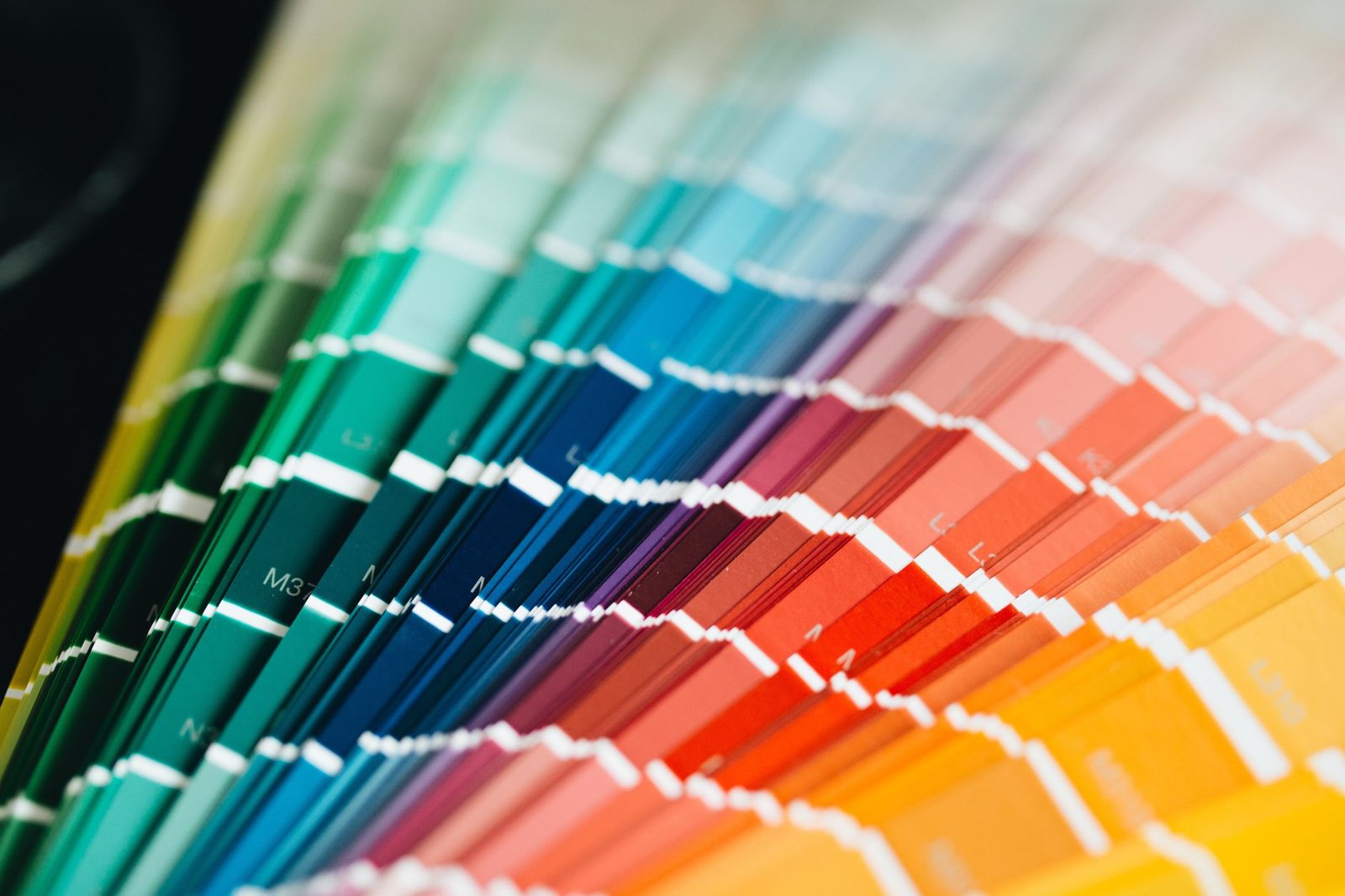
The orientation of a room and the inherent quality of natural light it receives are absolutely critical factors in the nuanced palette selection process. North-facing rooms, which typically receive cooler, indirect, and often subdued light throughout the day, often benefit immensely from the judicious application of warmer tonal values to counteract any perceived chilliness, thereby lending a much-needed sense of inviting coziness and warmth. South-facing rooms, conversely, are typically bathed in brighter, warmer, and more consistent light, allowing them to comfortably accommodate cooler or deeper tones without appearing dim or unwelcoming. East and west-facing rooms, characterized by their dramatic shifts in light quality and intensity from morning to evening, offer unique and exciting opportunities for palettes that transition gracefully with the sun’s daily journey, appearing vibrant at sunrise or sunset. As a steadfast and crucial rule, residents should always test paint swatches on various walls within a given room and observe them diligently under different natural and artificial lighting conditions throughout the entire day before committing to a final decision. This empirical and thorough approach ensures the chosen tones perform precisely as intended across all lighting scenarios, guaranteeing optimal atmospheric mood and spatial perception.
In conclusion, mastering color psychology in residential styling in 2026 means moving beyond superficial color choices to a deeper, more sophisticated understanding of tonal values. By thoughtfully considering how lightness and darkness, combined with specific hue choices and integrated with modern material innovations, profoundly impact spatial perception and emotional well-being, homeowners can expertly create environments that are not only aesthetically pleasing but also profoundly supportive and enhancing of their desired lifestyle. The precision of tonal alchemy offers an unparalleled pathway to truly transformative and expertly designed home environments that prioritize both beauty and domestic comfort.